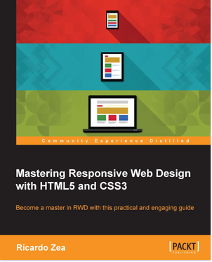
Autor: Ricardo Zea
Broj strana: 334
ISBN broj: 9781783550234
Izdavač:
PACKT PUBLISHING ![]()
Godina izdanja: 2015.
 |
 |
 |
 |
 |
||||
If you already know some HTML and CSS and understand the principles of responsive web design, this book is for you. There’s something here for you to learn regardless of if you’re a web designer or web developer, or whether you’re a seasoned expert web professional.
Responsive web design is getting more complex day by day and without the necessary design and development skill sets, it’s a matter of time before we’re left behind.
Building meaningful and accessible websites and apps using HTML5 and CSS3 is a must if we want to create memorable experiences for the users. In the ever-changing world of web designers and developers, being proficient in responsive web design is no longer an option, it is mandatory.
Whether you’re a web designer or web developer, or a seasoned expert web professional, this book will bolster your HTML and CSS skills to a master level.
The book is designed in a way that each chapter will take you one step closer to becoming an expert in RWD. The book begins with introducing you to the power of CSS preprocessors, Sass in this case, to increase the speed of writing repetitive CSS tasks, then use simple but meaningful HTML examples; and add ARIA roles to increase accessibility. You will also understand why a mobile-first approach is ideal.
Next, you will learn how to use an easily scalable CSS grid or if you prefer, use Flexbox instead. Create navigations for small screen devices using the “drawer navigation,” “off-canvas” or “toggle” navigation patterns, and also implement images and media in both responsive and responsible ways. Finally, you will build a solid and meaningful typographic scale and make sure your messages and communications display correctly with responsive emails.
Ricardo Zea, originally from Medellín, Colombia, is a passionate and seasoned full-stack designer now located in Dayton, OH (USA). He is always looking for ways to level up his skills and of those around him. Constantly wondering how things are made on the Web, how they work, and why they work the way they do have made Ricardo a very technical designer, allowing him to explain to others the intricacies of design and the technicalities of the Web in ways that are very easy to understand and assimilate.
With a master's degree in publicity and advertising and having a deep passion for understanding human behavior complemented with a fierce competitive PC gaming hunger have allowed Ricardo to "switch" from the creative side of the brain to the rational side very easily. This has allowed him to visualize and create technically sound web and mobile designs that are responsive, perform well, and convey the proper message through design.
Ricardo is the organizer of the CodePen Dayton meetup group. He's a member of the Dayton Web Developers and UX Dayton meetup groups. He's also one of the first members of SitePoint's Ambassadors program. He is the author of the monthly Web Design & Development, Level Up! Newsletter. He was also a technical reviewer for the books Sass and Compass, Designers Cookbook and Sass Essentials by Packt Publishing. He is a real-time, live one-on-one expert advisor on https://wizpert.com/. For several years, he was also a Flash and CorelDRAW professor at different universities in his home country, Colombia.
Ricardo has 15 years of experience in web design and 20 years of experience in visual and graphic design.
You can contact Ricardo through the following links:
Personal website: http://ricardozea.design
Twitter: @ricardozea (https://twitter.com/ricardozea)
Wizpert: https://wizpert.com/ricardozea
• Jovan Kulevski
Odlična knjiga kada izlazi? Je ima pretplata?
• Minuette Macon
Korisna knjiga. Kada Izlazi?
Hvala.

Popust cena:
1320.00 rsd

Popust cena:
2550.00 rsd
© Sva prava pridržana, Kompjuter biblioteka, Beograd, Obalskih radnika 4a, Telefon: +381 11 252 0 272 |
||